Contact Us
Related Posts


Categories


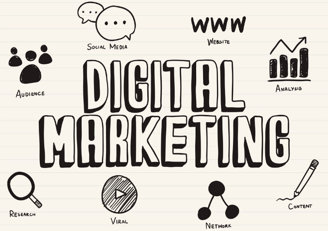
What is the concept of an infographic?
“An infographic is a powerful tool that combines statistics and data into beautiful, funny, or easily digestible photos that you can easily post on different platforms to ensure the knowledge you want to instill in readers get across as intended,” Fission explains.
What Are the Benefits of Using Infographics?
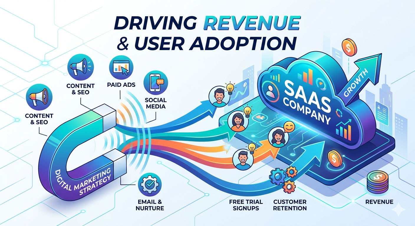
It’s no secret that visuals appeal to internet users, which is why infographics are so successful in digital marketing. Your followers are far more likely to read and share your content if you combine interesting facts with captivating images. Here are some numbers to support this:
- Text documents are 30 times less likely than high-quality infographics to be read.
- Visual knowledge accounts for 90% of data sent to the brain.
- Visuals are processed 60 times faster then text in the brain.
- Infographics have been shown to increase website traffic by up to 12%.
- Infographic-rich articles get up to 72 percent more views than non-infographic-rich articles.
This visual tool makes things simpler for your company’s content to stand out from the crowd and for your readers to understand what you’re saying. Here are a few more examples of why infographics are an important part of your digital marketing strategy:
- They improve your search engine optimization.
- They elevate you to the status of an authority figure.
- They help people remember your brand.
- They can make a dry topic more interesting or clarify a complicated topic.
Infographics for Digital Marketing: How to Make Them
It takes a few items to make an infographic:
- Detailed investigation
- Details are essential.
- Taking a wide view
- Promotional awareness
Step 1: Think of a subject to write about.
When you’re coming up with ideas, consider the following:
- Who is it that I’m attempting to communicate with?
- So, what exactly am I trying to get across?
- Will I be able to find reliable statistics if I have the data?
After you’ve compiled a list of three to five ideas, choose the one that you believe would be most appealing to your target market.
Step 2: Gather information.
Since infographics need a lot of data, you should plan on doing some research to fill in the gaps. Make a note of the source when you look for relevant facts and figures for two reasons:
- You’ll want to double-check that it’s trustworthy.
- You must cite their data as one of your sources if you use them.
Look for facts or data that can be broken down into maps, graphs, or lists as you dig for information; the more specifics you find, the more flexibility you’ll have when putting your infographic together.
Step 3: Compile data
Your big-picture thinking will come in handy here. Consider how all of the knowledge you’ve learned works together. How do you use the information you gathered to present information, tell a story, present an issue, and make an impact with the information you gathered?
First, one should like to arrange their facts and figures in the order in which they want to use them. One should write content to fill in the specifics after they have the basic framework of their infographic in place.
For example, if one gather data on the best time of day to post on social media sites, they could set up the following basic structure:
To begin,
Statistics from Social Media
Data by Platform is broken down as follows:
Final Call to Action: The infographic should be divided into many parts to make it easier to digest. Once one has completed the outline, they can fill in the specifics by:
- Creating an introduction that grabs the reader’s attention introduces the subject and encourages them to continue reading.
- Using unique sentences and bulleted lists to connect the data.
- Creating a call to action that leads them back to my website or one of my social media accounts.
Step 4: Double-check everything.
This is a crucial step in any content you produce for your digital marketing strategy that is often ignored. It’s particularly important to proofread during the making of an infographic because it’ll be far more difficult to fix errors after the graphic has been designed.
Here are several suggestions for proofreading:
- Take a break and do something else for a bit. Don’t start proofreading right after you’ve finished writing. Your eyes might be exhausted from looking at the computer screen for so long that your brain fills in the blanks of what you intended to write. Get up, go for a stroll, get a glass of water, and come back with new eyes. Creating a buffer between writing and editing will help you find more errors before they become a problem.
- Read it aloud to yourself if you haven’t already. Saying the words aloud will help you spot missing words, misspelled words, and a sentence that needs to be fixed. This easy trick works well and only takes a few seconds.
- Spellcheck isn’t the only choice. Many of us are accustomed to relying on Microsoft Word’s or Google’s red or blue underlines to indicate a misspelling or grammatical error. To correct an error, however, using spellcheck or right-clicking isn’t enough; you still need to pay attention to what you’ve typed. You could forget that you typed “shoe” instead of “show” if you just look at the markings. Even if the word “shoe” doesn’t fit in the sentence, since it’s spelled correctly, spellcheck will miss it.
- It can be found using Google. Do you have a word that you’re not sure how to spell? Look it up on Google. Type the term into the search engine at www.google.com. When Google returns your search results, it will also recommend a different spelling (for example, did you Mean: spellcheck?).
- Make a copy of it. Print it out and read it on paper if the text isn’t too long. When you look at a sheet of paper instead of a computer screen, you’re more likely to notice a mistake. Just remember to be environmentally conscious and use scrap or the backside of previously used paper, because you’ll be the only one who sees it.
Step 5: Create Design
Here’s where the design knowledge comes into play. Consider the overall look and feel you want to achieve with your infographic. Choose a few template elements to use in the graphic:
- A color scheme that is complimentary to your brand and includes 3-5 shades.
- Fonts are divided into two or three categories.
- Line widths that are the same for all.
Consider what kinds of visuals your copy could work well with. If one of your statistics mentions time, for example, a clock could be a good option. You may also use small people icons to visually reflect a group of people if you have a large group.
Charts and graphs are also a perfect addition to every presentation. This Venngage tip is fantastic:
- Binary Question Answers: A question with only two answer choices, such as “Yes” or “No,” has binary responses that total 100 percent when added together. Using pie charts and pictograms for figures that aren’t too complicated.
- Big Data Samples: For visualizing very large data samples from a wide range of sources.
- Showing a Pattern Over Time: A line graph (or multi-line graph) is a simple way to visualize patterns over time. A line chart or a combination chart may be appropriate.
- Question Responses on a Scale of 1 to 10: For questions like “Rate our customer service on a scale of 1 to 10,” the average score of the answers can be shown in a pie chart or donut pie chart.
- Question Answers with No Limits: “Do you have any ideas on how we should better our site?” is a good example of a question like this. Calculate the percentages for each answer category after organizing the responses into multiple quantifiable categories. Make a bar chart to visualize this.
- Proportional Differences: A stacked bar graph may be used to show the pieces of a whole.
At the very bottom of your infographic, make sure to reference your references. It verifies your information’s credibility and gives proper credit where credit is due, in addition to letting your readers know where they can get more data. When you’re finished with the design, double-check it for typos.
What Is the Best Way to Market an Infographic?
You’ve completed your first infographic, which is fantastic! However, the work isn’t done. What good are these tools if you don’t use them to promote them as part of your digital marketing strategy?
Step 1: Add your infographic to the site.
Be sure to use the largest version possible when uploading your infographic to your website. A large file can be scaled down, but it will appear pixelated and unprofessional if anyone attempts to post it in a larger size than you uploaded.
Step 2: Make a Code to Embed
The good news is that you don’t have to be a tech whiz to do this. Hubspot has included step-by-step instructions, including where to position the code in relation to the infographic and what it would look like when someone uses it.
What’s the point of embedding code? This acts as a backlink to your website. Rather than downloading and uploading the infographic to their website, they can simply connect to it on yours while the entire picture is displayed on theirs. This provides yet another link to your website, in addition to making it easier for their readers to find their way there.
Step 3: Disseminate! Disseminate! Disseminate!
Your infographic is now ready to post! The more you share your digital marketing material, the more people will see it: It should be included in your email newsletter and shared across all of your social media accounts. An infographic is also an excellent piece of material to pitch to the media for editorial coverage. Create a list of websites that you think would be a good match for your infographic and contact them with an explanation of why their readers would be interested in it. You never know who would come across it!